MVB Latam · Expedition Frankfurt
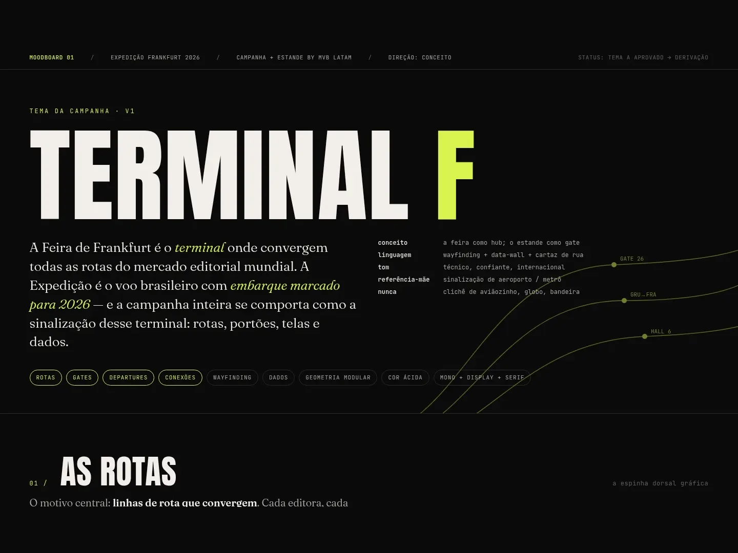
TERMINAL F
The world's largest book fair is a terminal: every route in publishing converges there. We turned that reading into a visual system that signals a 24m² booth from thirty metres away.
Services
24m²
Booth area
7
Wall panels
10
Annotated references
4
Open-licence typefaces
The airport teaches
An airport is the only place in the world where nobody truly gets lost.
You land in a city whose language you don’t speak, and you still reach the right gate. Because someone decided, decades ago, that movement information has rules: high contrast, condensed type, an arrow that points, a short code you memorise without effort.
A book fair has none of that.
Frankfurt is seven halls and thousands of booths competing with the same strategy: more colour, more image, more text. The result is noise. Nobody walking the aisle reads anything, because everything is asking to be read at once.
That’s where the turn came from: the fair is a terminal where every route in publishing converges. The booth is the departure gate.
The challenge
Expedition Frankfurt 2026 was debuting its own 24m² booth, facing the Brazilian stand. The first time with a space to call its own.
A booth isn’t an ad. It’s a physical object in the middle of an aisle, competing for three seconds of attention from someone who is walking, tired, badge bouncing on their chest, already late for the next meeting.
The design question was brutally concrete: what has to be written there for that person to turn their head, understand what this is, and decide to stop?
An alphabet before any artwork
We didn’t start by drawing panels. We started by building a public moodboard with ten annotated references — not to illustrate taste, but to extract rules.
From each one we pulled a decision: what makes a data wall work in black and white, how a street poster survives distance, why wayfinding doesn’t use imagery.
Out of that came a closed system in four layers: palette, three typographic voices, an alphabet of shapes and five composition laws. With explicit dos and don’ts.
It isn’t a locked identity — it’s a system direction. Four layers the team develops on its own: type, shape and composition.
That matters more than it sounds. A booth is produced by people who weren’t in the meeting: the printer, the installer, whoever runs the screen. The system has to survive people who never read the brief.
Legible at thirty metres, in three seconds
The rule that governed every piece of artwork: if it doesn’t read from thirty metres away in three seconds, it doesn’t ship.
That eliminated most of what usually fills a trade fair panel. No paragraphs. No product photography. No logo repeated at five sizes.
What stayed is what works at distance: display type bleeding off the edge, one sentence per wall, graphic routes converging on the meeting point, short terminal markers — gate, hall, origin and destination.
And the counterpoint: once someone stops, the register changes. Up close, the directory totem and the cubes work like a departures board — monospaced, dense, informative. Far away it shouts; up close it talks.
What we built
A complete visual system and three application fronts: the sponsorship folder, the booth wrap and the screen loop.
The wall pieces shipped as print-ready PDF/X, one page per panel, at real production sizes — 95 × 227 cm for the main panels, 44 × 227 cm for the vertical support. With a mockup of the assembled booth so the client could see the whole before the printer did.
Along the way the system was revised to speak to MVB’s global corporate identity: the brand red came in as a zone colour, the corporate typefaces took over the display voice. Good creative direction isn’t the kind that survives untouched. It’s the kind that still works after being adjusted.
Where books find their way.
Notes for the nerds
Colour system
#0B0B0Bink and#F2EFE8paper — 90% of any layout#D8F34Eacid — route and call to action#E3001BMVB red — stage, programme and brand#C9BFF5lavender — secondary zone- Palette audited by perceptual difference: the original orange left the system at ΔE 21 against the brand red
Typography
- Anton — display, wall headlines
- Fraunces — editorial, long copy
- JetBrains Mono — data, codes, departures board
- Archivo — interface and captions
- All OFL-licensed, with no licensing cost to the client
Print artwork
- PDF/X generated in Illustrator, one page per panel
- Wall panels at 95 × 227 cm (4 pages + 2 pages)
- Vertical support at 44 × 227 cm
- Colour profile and bleed checked for production
Kit deliverables
- Public moodboard with 10 annotated references and the rationale behind each decision
- Alphabet shapes as SVG
- Colour tokens in a reusable format
- Brand lockup in ink and paper variants
- OFL font pack for the production team
Validation criteria
- 30-metre, 3-second legibility test for every wall piece
- Two-stage reading hierarchy: display at distance, monospace on approach
Project Details
How would you like your story to be told?
Tell us what you have in mind. We listen before proposing anything.
Talk to us